Friday, May 7, 2010

CMYK

I bought a copy of CMYK Magazine not too long ago, and was really influenced my the layout of the cover. It is very grid oriented even though it seems random at some points. All of the text is very well lined up with the images, and adhering to the grid. When I see a design such as this I usually expect it to be messy and poorly done, but the people at CMYK know what they're doing. It give me a new hope to get good enough to do designs like this. Thanks for the motivation CMYK!

Screen printed Cd's


This is a CD I bought by the band Renae, and it was a limited edition of 200 hand screen printed covers. I thought it was really cool that bands are still doing this. Not only that though, but they chose a very anti-design type layout for it. Everything looks very photocopied, and hand cut out. While a cover like this wouldn't work for everyone, I thought it suited their style and music very well. It also gave it a bit extra that it's hand numbered! AWESOME!

Video games

Even though this seems pretty old and such I think the design is pretty decent, but more importantly the layout is good. The stripe of ridges contrasts the graphic image very well, and gives it an almost Swiss like layout. With a good 3 row grid, which the image take up 2 of those. The actual design of the image isn't as good. I think it's pretty good for the game, but nothing special. I just wanted to note Nintendo's layout choice.

pogs!

These are Pog pieces from the old crappy game, Pog. I chose to talk about these because the design is so varied, but many of these are reminiscent of the American Kitsch period. The colors are very bright, but subtle at the same time. Many of these also serve no purpose really beside looking interesting. I was happy to pull these out of my closet and give them a look a second time.

Logos

I saw this logo and thought it was awesome. I was really impressed with the implicity of the logo, but how it has two completely different images in it. Both add to the company also. There is a spartan and a golfer. This is really impressive considering their name is spartan golf. I would have to say that logos like this are really awesome, and all logos should be like this! good job Spartan Golf!

Monday, April 26, 2010

DANG!

Recently I've become obsessed with this Rot Beer. It's just call Dang! and jut he name alone was enough to get me, but I found the graphics to be awesome to. This is a scan of the 6 pack holder, and is pretty complex compared to the bottle itself. The bottle has no texture to it, and is all flat colors (no shadows). It looks like one of the simplest, while still being retro, packages I've ever seen. I thought it was pretty awesome myself, but also wanted to showcase it since it's the best tasting root beer I've ever had!

Interesting Sticker

This is a sticker I have for Oury Grips (for bicycles). It's a somewhat holographic sticker with a photo and text on it. I think it is a very interesting idea, and I would love the change someday to design something like this myself, but I think the execution of this sticker is pretty bad. All you can really see in the sticker is a grip towards the bottom, and the text towards the top. The rest of the stickers is wasted space to me. This sticker is also really small and even the text is nearly impossible to read. I love the idea, but it's not as god as I was hoping. However, I think it is a very unique idea!

Type breaking

I know we had talked about how it is not good to break type onto multple lines, and I think most would agree that it's not good to break the type onto different lines when some lines share multiple words. That's the case here. This is a patch I have for the band So Long Forgotten. These patches were designed to have quite the DIY (do it yourself) feel to them, and be visually entertaining to look at. I think they created something that has a great look to it, but isn't very legible when it comes to the type. I also think though that when it comes to bands legibility isn't the most needed aspect. If someone knows this band they will understand the type of it, and it will make sense. If they don't know the band it probably won't, but that goes back to the Psychedelic days of keeping the "square" people out. Although I don't think the term square is the proper term for this.

Bottles

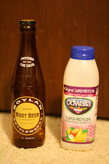
So recently I started to notice that different drinks will always be packaged differently. Sodas, when packaged in glass are always tall bottles with metal bottle cap. When they're packaged in plastic they're very similar in design, but with a plastic screw on cap. These bottles could pretty much be okay for all other types of drinks, but most won't use them. Take this Odwalla for instance, It's made out of a recycled plastic bottle that is rectangular and somewhat opaque in comparison to soda bottles. Other drinks similar to Odwalla are packaged the same. This package choice might be up to an industrial designed sometimes, but I know that some graphic designers get to make choices like this, especially when the product has a more environmental stance. I just thought it was very interesting how neither of these bottle designs, as far as shape goes, has a benefit over the other, but it's something that drink companies don't vary on at all. I think if a soda company were to create a drink in the Odwalla container they could create something big, but who knows until it happens.

Wednesday, April 7, 2010

Band logos


After looking at the Psychedelic posters, and how illegible their type was it made me think about modern bands. I know I had mentioned in class that some death metal bands these days are even more outrageous than the bands from the Psychedelic times. This is the best example I can think of. It's for the band Waking the Cadaver, and this is the logo that they use for everything including shirts and posters. Imagine a poster with 10 logos like this on it, and no legible type that says the bands' names on it. I think this is about as far as you can go to make sure that only the "in" people know about something. I posted the logo two times so you can see it with the text in red, and then the logo how it is made to be. I hope you enjoy it, and learn that some people push the limits more than we might ever realize.

Sunday, February 28, 2010

Waldo

I frequent this blog for fixed gear bikes called Prollyisnotprobably.com, and this was a flyer on there for an event. At first I thought nothing of it, but as I looked at it again I noticed that Waldo had been made with some bicycle parts. His mouth is a piece of chain, and his glasses are wheels. I think it is really great when people make an image fit into the theme of the design with things such as this. It really makes it interesting to look at, and if you're a bike nerd like me you might just notice something new each time you see it. That is great because it takes a lot longer to get tired of the design.

Billboards

When searching online for billboard designs I came across this website. http://www.toxel.com/inspiration/2009/01/05/clever-and-creative-billboard-advertising/. It was one of many that had lots of crazy billboards, but I thought this one was the best. I'm not sure how practical it would be though. When most people only see billboards for a fraction of a second they aren't giving it the attention it deserves, and I think this light bulb would take longer to notice. This is because without the person under it there isn't much sense to make of the design, but when someone is under it that totally changes, and it becomes great. I would also worry that during sunny days people wouldn't see it light up too well. In all, the concept of this billboard is awesome, but I'm not sure how effective it is. However, it did get enough attention to make the website.

Tie Dye!

Sorry I had to take this with my webcam because the print is too large for my scanner, but this is a shirt that I own that I thought was very interesting. It is by the company Altamont. Not only is the text on it very chaotic, but so is the color of the shirt. I very rarely see clothing companies making shirts with tie dye and all over printing in one, but this is the exception. It also has a very nice tie dye pattern, which is a vertical stripe, but with black in random areas. This makes it even more chaotic. I just thought it was a very awesome and unique shirt that used the grunge era very well.

Watch wrist strap

I found this at http://ialreadyhaveawatch.com/ They had a lot of interesting watch ad, but I had never seen this before, so I figure it would be perfect. I can't really tell what the ad says, but I don't think that's very important. What's important is the thought put into this ad, and the placement of it. If you were on a bus and you saw these watches I really doubt you would pass by without reading it, and if you do read it then it has done it's job. It not only grabs your attention, but it's something you won't forget, which is very hard to do. In all, these are great!
Add Image

Friday, February 12, 2010

Movie title stills

I found this website where they have hundreds of movie title stills documented. You can go through different years and see all the different styles they have gone through. I thought this was especially good for this class because of the variety of styles you can see. Most people only think of graphic designers creating the cover and maybe a poster for the movie, but they also would have had to design these title stills. Choosing what font, color, placement, and what else to incorporate with it can be very difficult, but almost all of these are great. I chose one to show because it showed more than just the movie logo, so for people browsing they could get a grasp for whatit actually was easier. Before today I had never thought about what went into the introductions of movies, but now they seem more fun. Maybe someday I'll get to do one!

Monday, February 8, 2010

New media

I found this picture on some blog. I don't think it was a design blog, but it serves the right function. People could soon be serving as a new form of billboard. Tattoos often get more attention than billboards, and if they're in an obvious spot they will surely be seen a lot. I'm not sure how much people like this have gotten paid, but those are there forever. I will be interested to see what the future of advertising tattoos are. I have already seen a hand full online. If it get popular I wouldn't be surprised to see people specializing in it.

Monday, January 25, 2010

Water Bottles

It seems like the new hip thing to do is be conscious of our environmental impact, and our bodies. This is great, but when it becomes trendy to do so you start to get more and more designers doing designs for "green" companies. I personally enjoy all of these, and am really intrigued by these designs. I chose this water bottle to talk about because it is something that most people wouldn't always thing of when it comes to graphic design, but it certainly is a great example. The designer has to make the illustration, the logo, and choose the whole color scheme of it (even the bottle cap). hey sell these bottles a B.lime downtown, and when I saw them I was amazed at how many different bottles and sizes they had to choose from. It seems this eco-friendly market is really working hard to on their designs, so that they can portray the image they want to.